
Van Gogh Inspired Digital Art Prints: 2026 Buying Guide
Table of Contents
- Why Van Gogh Inspired Digital Art Prints Belong in Modern Homes
- What Makes Museum Quality Art Prints Different
- How to Frame Digital Art: Sizes, Materials, and Hanging Systems
- Post-Impressionist Wall Decor for Living Rooms and Bedrooms
- Large Format Expressionist Canvas and Multi-Panel Styles
- Digital Frame Compatibility and Art History Context for Modern Decor
- Pricing, Licensing, and What to Know Before You Buy
- Frequently Asked Questions
Last Updated: September 14, 2026
Why Van Gogh Inspired Digital Art Prints Belong in Modern Homes
Van Gogh inspired digital art prints bring post-impressionist energy to your wall without museum loans or auction-house prices. Artist Ray van Buren reinterprets self-portraits, landscapes, and village scenes into a modern digital format for contemporary interiors.
The appeal is color: Van Gogh's palettes were built for impact, and high-resolution digital translation keeps it intact. But any download won't do, whether a print looks alive in five years or fades in eighteen months comes down to paper, ink, and file preparation.
What Makes Museum Quality Art Prints Different
Museum quality art prints rest on archival-grade paper, pigment-based inks, and distortion-free color reproduction.
Judging a print by the image alone is a mistake. Cheap poster paper is acidic and yellows from the inside out regardless of sunlight; archival paper is buffered against that decay, staying neutral for decades.
Archival Paper, Giclée Printing, and Color Accuracy
Giclée printing uses pigment inks rather than dye-based inks, and the distinction is not marketing. Pigment particles sit on the paper surface and resist UV breakdown far better than dye, which soaks in and fades faster.
Color accuracy depends on the source file as much as the printer. A high-resolution file with correct color profiles produces smooth gradients and true blacks. A compressed file produces banding, and banding is the first thing the eye catches on a large-format piece. For more on how museums approach print longevity, the Library of Congress preservation guidance outlines how environmental and material factors affect long-term display.
Digital Download vs. Physical Print: Which Fits Your Space
Digital download versus physical print is a trade-off between control and convenience. A download gives flexibility on size and paper, but you own the printing decisions. A physical print arrives ready to hang, with paper and ink already chosen.
If you need a specific size for an existing frame, a download makes sense. If you want something finished, with framing and hanging hardware included, a physical print removes the guesswork. For most buyers, the finished option wins.
How to Frame Digital Art: Sizes, Materials, and Hanging Systems
How to frame digital art comes down to three decisions: frame profile, mat, and hanging hardware. Get the profile right and the artwork leads; get the mat and hardware wrong and even a museum-quality print looks like a poster.
Start with the frame profile. A heavy, ornate frame fights a vibrant expressionist canvas; a clean, narrow profile lets color lead. Sustainably sourced oak and ash add warmth without competing, while metal frames read colder and can flatten a post-impressionist palette.
Sizing Math: Frame, Mat, and Print
The most common framing mistake is buying a frame the same size as the print, leaving no room for a mat. Size the frame so the mat border is roughly one-eighth to one-quarter of the print's shorter dimension: a 16 x 20 inch print sits comfortably in a 20 x 24 inch frame with a 2-inch mat border.
Mat width affects how the piece reads: a narrow mat (1 to 1.5 inches) feels larger and more contemporary, while a wide mat (3 inches or more) feels like a gallery piece but needs a larger frame. For a large-format canvas, skip the mat and use a floater frame, which holds the canvas with a small visible gap so the painted edge stays exposed.
Glass, Plexiglass, and UV Protection
Behind the frame, plexiglass is lighter, resists shattering, and modern formulations include UV filtering that slows fading. The trade-off is surface softness: it scratches more easily than glass, so clean it with a soft cloth and plastic-safe cleaner rather than ammonia-based spray. In a high-traffic hallway, glass may hold up better cosmetically despite being heavier and more fragile.
UV filtering slows fading but does not stop it: a print behind UV plexiglass still fades in direct sun. Keep pieces out of direct sunlight and rotate any in a bright southern exposure.
Hanging Hardware and Wall Type
Hanging hardware should match the wall, not just the frame weight. Drywall anchors suit a light print in a small frame, but a large-format piece in a wood frame needs a stud-mounted French cleat or two anchored D-rings; a single drywall hook fails the first time someone bumps it.
For multi-panel sets, a laser level and consistent gap matter more than the hardware. Measure the gap before drilling, and mark the top and bottom of each panel so the set stays level across its full width.
Framing a Digital Download vs. a Physical Print
With a digital download, you control every framing decision, both the advantage and the work. With a physical print, paper and ink are already chosen, so match the frame to the room and confirm the aspect ratio before ordering: a square file in a rectangular frame crops the edges, and on a multi-panel set that crop misaligns the panels.
DIY Printing and Paper Selection Guide
If you print at home or through a local shop, paper choice determines the result more than the printer.
- Matte archival paper: Best for reproducing brushstroke texture and impasto technique without glare. The default choice for post-impressionist work.
- Cotton rag paper: Heavier, textured, and the closest match to fine art paper used in galleries. Higher cost, better hand feel.
- Satin or luster photo paper: Adds slight sheen and deeper blacks, but can look commercial on a large-format piece.
- Canvas: Requires stretching or mounting, but reproduces the physical presence of a painted surface better than flat paper.
Paper weight is measured in grams per square meter (gsm). Standard copy paper runs 75 to 90 gsm; a substantial print usually runs 200 gsm or higher, and cotton rag fine art paper often sits around 300 gsm. Heavier paper resists cockling, the wavy buckling that happens when ink saturates a thin sheet.
Printer settings matter too. Set the highest quality photo mode, select the correct paper profile, and turn off automatic color enhancement. Let the print dry flat for several hours before framing, because pigment inks on coated paper can stay tacky.
Check the aspect ratio before printing: a square composition printed to a rectangular frame crops the edges, and on a multi-panel set that crop breaks alignment.
Post-Impressionist Wall Decor for Living Rooms and Bedrooms
Post-impressionist wall decor works best as the loudest thing in a quiet room. A neutral sofa, plain wall, and one large vibrant canvas creates more presence than a gallery wall of small pieces competing for attention.
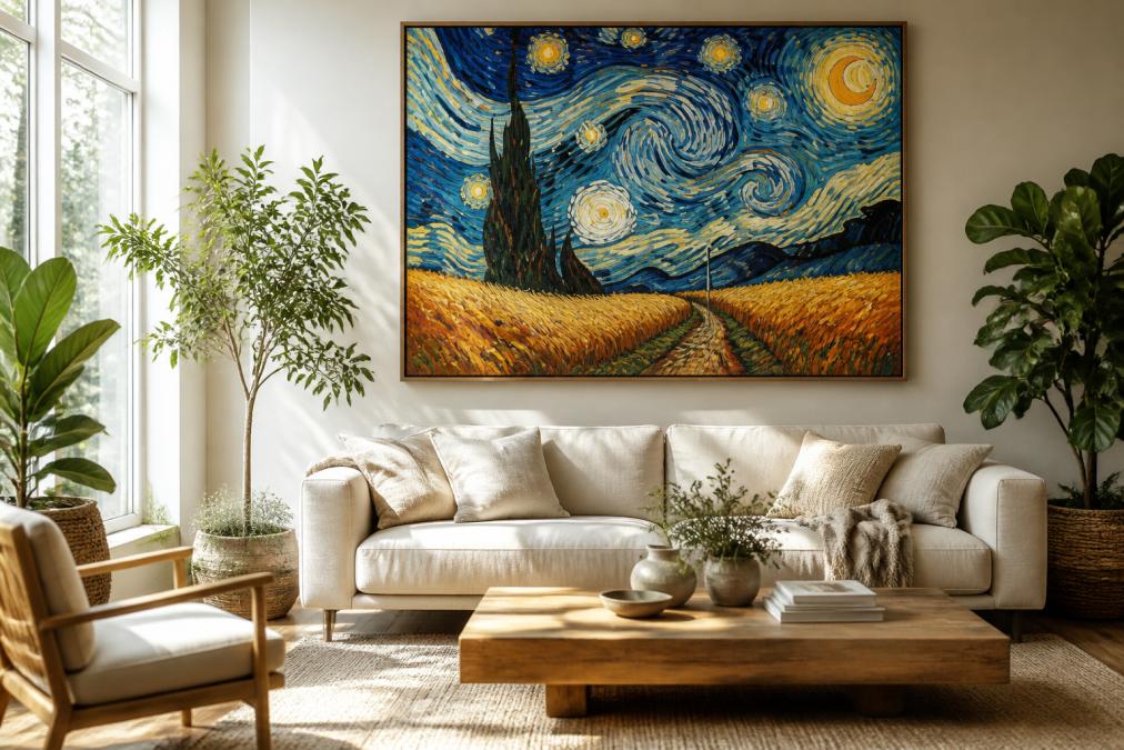
Bedrooms call for a different approach: scale down or shift to a calmer piece, and hang it opposite the bed rather than above the headboard, where it competes with the room's focal point. Living rooms can take full large-format impact; bedrooms usually cannot.
For a minimalist interior, one bold piece does the work of five: color becomes the room's accent, so keep furniture, textiles, and lighting neutral and let the artwork carry the visual weight.
Large Format Expressionist Canvas and Multi-Panel Styles
Large format expressionist canvas changes a room's proportions: a single oversized piece reads as architecture, not decoration, and can make a small room feel intentional rather than cramped. The artwork should cover roughly two-thirds to three-quarters of the width of the furniture below it. Above a 72-inch sofa, that means a piece 48 to 54 inches wide, or a multi-panel set spanning that width with gaps included.
Single Canvas vs. Multi-Panel: How to Choose
A single canvas is simpler: one hanging point, one level line, no alignment to maintain. It suits a wall with a clear center and a room where the artwork is the only focal point.
A multi-panel set splits one composition across two or more panels. The advantage is flexibility: hang panels with a gap that suits your wall width, and the format reads as a deliberate installation. The drawback is alignment: panels must be hung level and evenly spaced, and the composition has to be designed for the split rather than cropped into it.
Panel count changes the feel. A two-panel diptych reads as a balanced pair over a bed or sofa; a three-panel triptych reads as a sequence and suits a wide living room wall. Four or more panels read as a gallery wall and need more wall width to avoid feeling crowded.
Spacing Math for Multi-Panel Sets
The gap between panels separates a set that looks intentional from one that looks like a mistake. A consistent 1.5 to 2 inches between panels works; wider gaps (3 inches or more) make the panels read as separate pieces rather than one composition.
Measure the total span before drilling. Three 20-inch panels with 2-inch gaps span 64 inches. Confirm that fits the wall with a few inches of margin on each side, and center the whole set rather than the middle panel.
Aspect Ratio and Composition
Aspect ratio determines whether a composition survives being split. A square composition splits cleanly into two or four panels because each carries a balanced portion of the image; a wide panoramic composition splits naturally into a triptych. A tall portrait composition is harder to split without one panel carrying most of the subject.
Square large-format pieces, like the 70x70 cm format in the Artist Ray van Buren collection, avoid the cropping problem entirely: a square composition hung centered holds its balance without a frame proportioned to a rectangle.
Digital Frame Compatibility for Large-Format Files
If you plan to display a large-format file on a screen instead of printing it, digital frame compatibility becomes the constraint. Most digital frames accept standard image formats, but they handle color and resolution differently than print, and a file optimized for paper may look oversaturated on a backlit display.
Export a separate version for screens: slightly lower contrast, correct sRGB color profile, and sized to the frame's native resolution. A 4K frame displays roughly 3840 x 2160 pixels, so a smaller file gets upscaled and softened while a much larger one wastes resolution. Match the file's aspect ratio to the frame's to avoid letterboxing or cropping.
Digital Frame Compatibility and Art History Context for Modern Decor
Understanding the art history behind the style changes how you hang it. Post-impressionism was a reaction against impressionism's focus on light, pushing toward emotion, structure, and bold color. That context explains why these pieces work as statement art rather than background decor. For a broader look at the movement, the Metropolitan Museum of Art's Heilbrunn Timeline of Art History covers the period in depth.
Post-impressionist work was built to carry emotion through color, not to blend into a room. Hang it as the focal point, not as filler.
Pricing, Licensing, and What to Know Before You Buy
Pricing for art prints depends on format, size, framing, and whether you buy a physical piece or a digital file, so cost varies by configuration. Check the product page for current pricing rather than assuming a rate.
Licensing is the part buyers overlook. A digital download for personal display is a different license than one for commercial use. If you plan to use the artwork in a business setting, a publication, or a product, confirm the commercial license terms before purchase. Personal-use files generally cannot be resold or reproduced for clients.
Buying Consideration |
What to Check |
Why It Matters |
|---|---|---|
Print format |
Physical print vs. digital download |
Determines whether you control paper and size |
Paper and ink |
Archival paper, pigment inks, giclée |
Affects fade resistance and color accuracy |
Frame material |
Oak, ash, plexiglass with UV filtering |
Protects the print and matches the interior |
License type |
Personal vs. commercial use |
Governs resale and client work |
Aspect ratio |
Square vs. rectangular, panel count |
Prevents cropping and misalignment |
Every piece in the Artist Ray van Buren collection arrives signed, which matters if you are buying for long-term display rather than a temporary wall filler. The U.S. Copyright Office guidance on derivative works is worth reading if you plan to reproduce or adapt any purchased artwork.
Choosing art for a wall is easy. Choosing art that still looks right in five years, in a room you have not finished decorating yet, is harder. Artist Ray van Buren approaches that problem with a curated collection of five large-format pieces, printed at museum quality through Gelato, framed in sustainably sourced oak and ash, and protected behind shatter-resistant plexiglass with UV filtering. Each piece is personally signed and arrives ready to hang with the mounting system included. Explore the collection and find the piece that earns its wall.
Frequently Asked Questions
What makes digital art prints 'museum-quality'?
Museum quality art prints use archival paper or canvas, pigment-based inks, and a high-resolution printing process like giclée. These materials resist fading for decades and hold color accuracy better than standard posters. Look for acid-free paper, a stated color profile, and details about the printer used. When a print is also signed by the artist, it adds a layer of exclusivity and collectible value that mass-produced posters cannot match.
How do I choose the right size for Van Gogh inspired digital art prints?
Start with the wall, not the artwork. For a sofa or bed, a print should span roughly two-thirds of the furniture width. Large format pieces, such as a 28x28 inch square canvas, work well as a single statement above a couch or as part of a gallery set. Measure your wall, tape out the dimensions with painter's tape, and check the aspect ratio before ordering so the piece feels intentional rather than crowded.
Are Van Gogh inspired digital prints considered original art?
They are original digital artworks inspired by Van Gogh's style, not reproductions of his actual paintings. Artists like Ray van Buren reinterpret post-impressionist techniques such as impasto brushstroke texture and vivid color palettes through digital tools, then print them as limited or signed editions. This makes each piece a contemporary work with its own artistic heritage, distinct from a poster copy of Starry Night.
How should I care for and display my digital art prints?
Keep prints out of direct sunlight, since UV exposure fades even archival inks over time. Frame behind plexiglass or glass with a mat to prevent the surface from touching the glazing. Dust with a dry microfiber cloth, never a wet one. For canvas prints, avoid humid rooms like bathrooms. If you rotate your collection seasonally, store unframed pieces flat in an acid-free portfolio, away from heat and moisture.