
10 Minimalist Style Wall Art Trends for 2026
Table of Contents
- 1. Warm Minimalism and Earth Tones
- 2. Biophilic and Natural Textures
- 3. Minimalist Line Art and Monochrome
- 4. Abstract Wall Art Trends
- 5. How to Style Minimalist Art in a Modern Home
- 6. Modern Minimalist Wall Decor Ideas for Every Room
- 7. Minimalist Interior Design Trends 2026: Sustainability and Small Spaces
- Conclusion
- Frequently Asked Questions
Last Updated: September 15, 2026
1. Warm Minimalism and Earth Tones
Warm minimalism replaces the cold, sterile look that gave minimalism a bad reputation for years. Earth tones, neutral palettes, and organic shapes now define the 10 minimalist style wall art trends for 2026.
This is the shift I keep coming back to as an artist: minimalism stopped being about absence. It became about warmth. Terracotta, clay, sand, and muted olive tones dominate this trend, and they work best when a single large-format piece carries the room instead of a cluster of small frames.
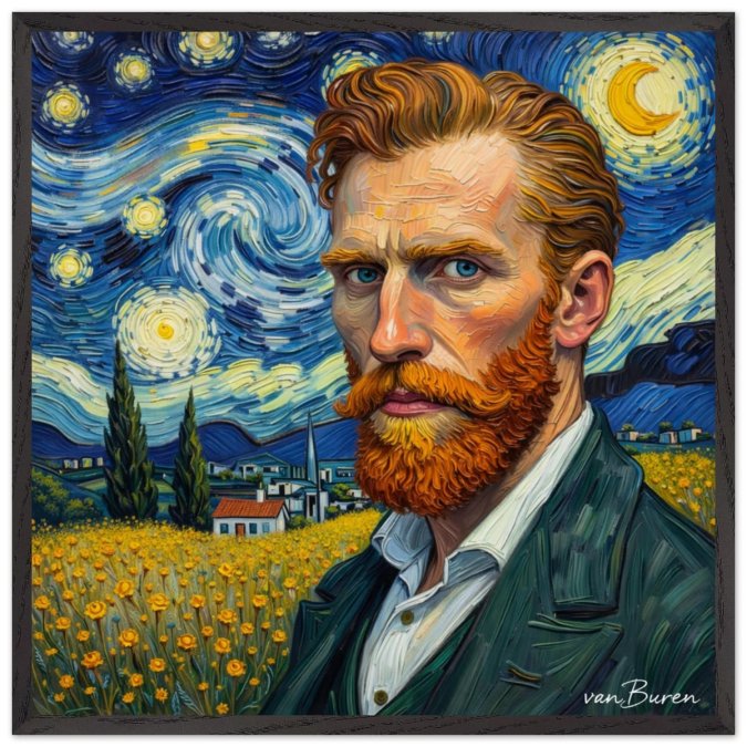
- Self portrait of Vincent in field near village
A common mistake is pairing warm tones with cool gray walls. The colors fight each other, and the art loses its glow. Choose off-white, cream, or soft beige backdrops instead.
2. Biophilic and Natural Textures
Biophilic design brings natural textures indoors, and wall art is now part of that system rather than a separate decoration layer. Botanical prints, raw wood frames, and textured surfaces all serve the same goal: a serene environment that feels connected to nature.
The strongest version of this trend pairs real materials with restraint. One botanical print in a solid oak or ash frame does more than five prints in thin plastic frames ever will. The wood grain itself becomes part of the composition, which is exactly why I chose responsibly sourced oak and ash for my own framed pieces.
Where it falls short: textured surfaces collect dust and are harder to clean than flat canvas. If you have allergies, favor a matte print behind plexiglass over an exposed fabric or plaster surface.
3. Minimalist Line Art and Monochrome
Minimalist line art is a style of wall decor built from a single continuous stroke or a few sparse lines, usually in black on white or a neutral ground. Monochrome takes the same idea and strips color entirely.
Line art remains the most affordable entry point into minimalist decor, and it is the easiest trend to get wrong. Scale is everything. A small line drawing floating on a large wall looks accidental. Either go oversized for a statement piece or group three pieces into a tight, deliberate triptych.
Color theory matters here too. In a monochrome room, one line drawing becomes the focal point by default, so placement deserves more thought than the artwork itself.
4. Abstract Wall Art Trends
Abstract canvas work is moving toward geometric composition and restrained color, not chaos. Organic shapes, soft gradients, and two or three colors maximum define the current wave.
Here is where I part ways with most trend reports. Pure minimalism can feel emotionally flat, and that is the gap expressionist work fills. A large format expressionist canvas in a neutral room adds energy without breaking the calm, because the palette stays controlled even when the brushwork does not.
5. How to Style Minimalist Art in a Modern Home
Learning how to style minimalist art comes down to four decisions: height, scale, breathing room, and light. Get those right and almost any piece works.
Height. Center the artwork at eye level, roughly 57 to 60 inches from the floor to the middle of the frame. This is the museum standard and it holds whether you are hanging above a sofa, a console, or nothing at all. When hanging above furniture, leave 6 to 8 inches of wall between the top of the furniture and the bottom of the frame, closer than that and the piece feels like it is sitting on the sofa; farther and it floats.
Scale. A common rule of thumb is that art should span 60 to 75 percent of the width of the furniture below it. On a 72-inch sofa, that means a piece roughly 43 to 54 inches wide. A single 28x28 inch framed poster works on a narrow wall or paired with a second piece; on a wide wall it needs a larger format or a deliberate grouping.
Breathing room. Keep 60 percent or more of the wall empty around a statement piece. This is where most people fail, they treat empty wall as a problem to solve rather than the frame around the artwork.
Light. Hang warm-toned art where it catches late afternoon light, and keep high-contrast black-and-white pieces out of direct sun, where glare flattens the line work.
Here is the part most trend reports skip: the psychology of minimalist decor. A single focal point gives the eye one place to rest, which reduces the visual scanning that busy gallery walls demand. Most practitioners find that rooms with one commanding piece feel calmer and read as more intentional than rooms with many small works, the effect is less about the art itself and more about removing the low-level decision fatigue of "where do I look." That is the real argument for restraint, and it is why minimalist wall art pairs so well with home offices and bedrooms where focus matters.
- One large piece beats three small ones on a narrow wall
- Match frame material to one other wood tone in the room, never two
- Hang before you buy furniture if the art anchors the room
- Use a level and painter's tape to test placement for a day first
- Keep the bottom edge 6 to 8 inches above furniture, not touching it
Art placement is the step most people rush. Tape the outline on the wall, live with it for 24 hours, then commit.
6. Modern Minimalist Wall Decor Ideas for Every Room
Modern minimalist wall decor ideas change by room because the function changes. A living room wants one commanding piece. A bedroom wants lower contrast and softer tones. A home office wants something that holds up on camera. Here is how to apply the trends room by room, with the specifics that actually matter.
Living room. A single oversized canvas or a curated gallery wall of three aligned pieces. On a standard 8-foot wall, a 28x28 inch framed poster holds a large wall without crowding it, especially when paired with a low-profile sofa. If the wall is wider than 10 feet, go larger or add a second piece in the same frame material to keep the composition balanced.
Bedroom. Muted tones, matte finish, low visual noise. Skip high-contrast black and white here, the eye reads it as alerting rather than restful. Warm earth tones and soft neutrals support the wind-down function of the room. Hang lower than you would in a living room, closer to 54 to 57 inches to center, so the art is visible from a seated or reclining position.
Home office. Line art or a single abstract piece positioned in your eyeline on video calls, roughly 57 to 60 inches to center, or just above the top of your monitor. Keep the palette neutral and matte to avoid glare on camera. This is also where the psychology angle pays off: one focal point behind you reads as composed and intentional, while a busy wall reads as distracting.
Hallway. A vertical stack of two pieces creates spatial harmony in a narrow space. Keep the gap between frames consistent, 2 to 3 inches, and center the stack at 57 to 60 inches. A narrow hallway is the one place where two smaller pieces genuinely beat one large one, because the wall is too narrow for a wide format.
Small spaces and studios. This is the room category most trend reports ignore, and it is where minimalist art does the most work.
Room |
Best Format |
Tone |
Placement Height |
|---|---|---|---|
Living room |
One oversized piece |
Warm earth tones |
57-60 inches to center |
Bedroom |
Single muted canvas |
Low contrast |
54-57 inches to center |
Home office |
Line art or small abstract |
Neutral, matte |
Eyeline when seated |
Hallway |
Vertical stack of two |
Monochrome |
57-60 inches to top piece |
Small space / studio |
One large piece on longest wall |
Warm neutral |
57-60 inches to center |
7. Minimalist Interior Design Trends 2026: Sustainability and Small Spaces
Conclusion
Frequently Asked Questions
What will be the most popular wall art in 2026?
Warm minimalism and oversized abstract pieces are leading for 2026. Earth tones, textured surfaces, and large-format canvases that act as a focal point are replacing small, busy prints. Minimalist wall art in neutral palettes with organic shapes is the most requested style for modern interiors.
How do I choose minimalist art for a modern home?
Start with your room's palette. A neutral base allows one bold statement piece to anchor the space. Consider scale: a 28x28 inch framed poster works well above a sofa or console. Look for matte finishes and sustainable materials to keep the look intentional and cohesive.
Is minimalist wall art still in style for 2026?
Yes, but it has evolved. The 2026 version favors warmth over stark white. Think earth tones, biophilic textures, and handcrafted details. Minimalist wall art now includes oversized abstract canvases and botanical prints that add depth without visual clutter.
What are the trendy elements in minimalist design for 2026?
Key elements include Japandi influences, mixed media textures, and geometric compositions. Sustainable decor and small-space optimization are driving design choices. Monochrome line art and curated gallery walls remain popular for creating visual balance in modern minimalist wall decor.